Problem
As the design system evolved and product teams scaled, maintaining UI consistency became harder to manage. Designers lacked a lightweight way to detect system deviations inside their design workflow, so inconsistencies surfaced late in development, creating recurring design↔engineering rework.
The pain
Outdated/legacy Shield components that needed updating
Detached components breaking connection to the Shield system
Unlinked elements no longer connected to the Shield library
Layout inconsistencies in spacing, alignment, and structure
Branding inconsistencies across screens and experiences
How I identified the problem
I first noticed the issue in day-to-day product work: design QA wasn’t happening in a consistent way, and the same types of mismatches kept surfacing late, after handoff, or even once engineering had already started building. The problem wasn’t that teams didn’t care about standards. The problem was that checking for drift was still mostly manual, scattered, and easy to miss in fast-moving workflows.
To validate that this wasn’t just an isolated frustration, I gathered real examples of drift across files and spoke with people involved in the handoff process. The pattern was consistent: designers were spending too much time checking work manually, engineering was finding inconsistencies too late, and both sides were paying for it through avoidable back-and-forth.
What I did
Collected real examples of drift across components, spacing, and layout structure
Mapped where QA was happening in the workflow, and where it was breaking down
Identified a clear pattern: teams had no scalable way to detect design-system drift while designing
Turned that pattern into a product opportunity: embed QA inside Figma, before handoff

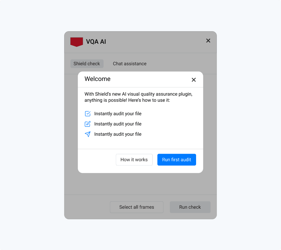
Introducing the AI-powered QA plugin, guiding designers to run their first automated audit.
How I Convinced Stakeholders
When the Innovation team began exploring AI use cases, I used this problem as a concrete opportunity to show where automation could create immediate value for design teams. Instead of pitching “AI for AI’s sake,” I framed the plugin around a specific workflow cost: teams were losing time to manual QA, avoidable inconsistency, and revision loops that surfaced too late.
I made the case using evidence from real product work, examples of drift, demonstrations of the current manual review process, and the hidden cost of rework between design and engineering. That shifted the conversation from a generic design-systems problem to a clear internal product opportunity with practical adoption value.
The cost showed up as
The problem was recognized as a workflow issue worth solving, not just a “designer annoyance”
The team aligned around building an embedded QA workflow inside Figma as the MVP direction
What changed in the workflow
Before the plugin, QA was mostly manual and inconsistent. Designers had to rely on personal diligence, design reviews, or engineering feedback to catch drift, often after handoff, when the cost of fixing it was already higher. That meant outdated components, spacing issues, and broken library connections could slip through until late in the process.
The plugin changed that by moving QA earlier and making it part of the design workflow itself. Instead of waiting for someone else to spot issues, designers could run a check inside Figma, see problems in context, and fix them before handoff. The value wasn’t just “fewer errors.” It was a cleaner loop between design intent and implementation.
Before
Manual QA checks
Inconsistencies often found late
Rework loops between design and engineering
No scalable way to validate files before handoff
After
Designers run QA directly inside Figma
Issues are flagged before handoff
Feedback is visual and actionable
Designers can resolve drift earlier and with more confidence

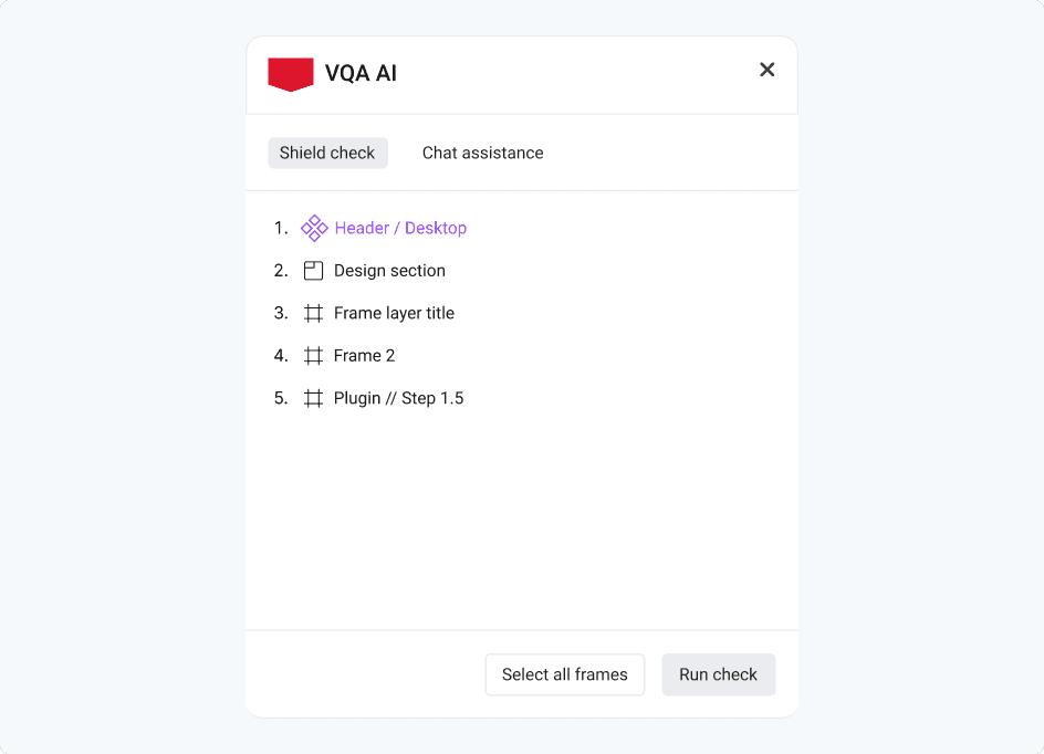
VQA AI plugin enabling designers to select frames and run automated Shield compliance checks directly within Figma.
The solution:An Audit → Explain → Fix loop inside Figma
I designed the plugin as a lightweight pre-handoff workflow that fits into how designers already work. Rather than creating a separate review process or a static report, the plugin helps designers move through a simple loop: audit the work, understand what’s off, and apply compliant fixes before engineering picks it up.
Core capabilities
Detect - flags design-system violations directly in the Figma file
Explain - provides context on what’s wrong and why it breaks Shield standards
Fix - suggests and applies compliant replacements so teams can correct issues faster
Workflow walkthrough
The workflow was designed around one key principle: give designers enough automation to move faster, without taking away control.
Start audit
Designers trigger the audit when they’re ready, rather than having it run automatically in the background.
Choose frames to audit
Instead of scanning an entire file and overwhelming the user, the plugin allows designers to scope checks to the work they’re actively reviewing.
Review suggestions
The plugin highlights non-compliant elements and surfaces recommendations in a way that’s easy to understand in context.
Take action
Designers decide what to do next: review, ignore, or fix, rather than having the system make silent changes.
Apply fixes
Suggested replacements help bring the file back into alignment with Shield standards before handoff.

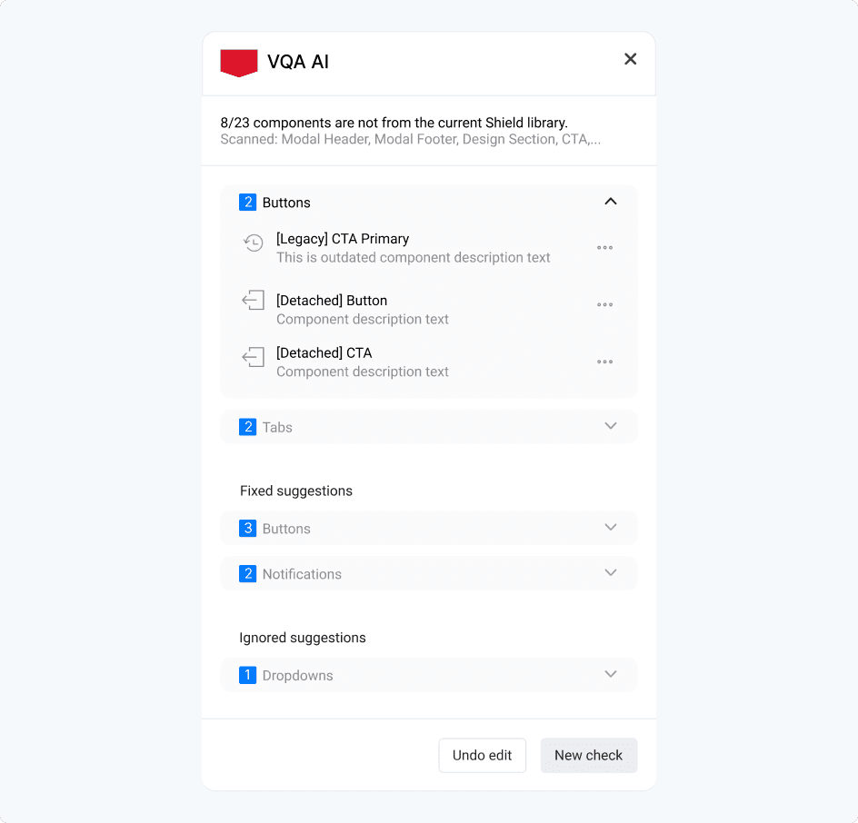
Automated audit results highlighting Shield violations, including legacy and detached components, with actionable suggestions for correction.
Tradeoffs
Precision vs usability
We could flag everything and overwhelm designers, or focus on the violations that create the most drift. We prioritized actionable issues that designers could fix quickly.
Automation vs trust
We avoided “silent auto-fixes” that change designs without explicit designer control. Instead, we used clear explanations + preview + manual apply to build confidence.
Full-file audit vs scoped audit
To make the tool practical in real workflows, we allowed designers to scope audits to specific frames rather than forcing a noisy full-file scan.
AI guardrails
Because this is AI-assisted, I designed guardrails around trust and failure modes:
Explainability: every flag needs a clear “why” and a path to a compliant fix.
False positives: designers need the ability to ignore or dismiss issues for a session.
No destructive changes: fixes should be previewed and explicitly applied.
Version drift awareness: Shield evolves, so the system needs a clear source-of-truth versioning approach
Early adoption - Signals of Value
In early piloting, the strongest feedback wasn’t just about detection accuracy, it was about trust and usability. Designers responded best when the tool felt like a helpful review partner rather than an automated enforcer. Scoped audits reduced overwhelm, explainable feedback made issues easier to act on, and manual fixes gave users confidence that they were still in control of the final design.
At this stage, the plugin showed promise in three areas:
Making pre-handoff QA feel faster and more manageable
Improving consistency in how Shield components were applied
Creating a clearer shared standard between design and engineering
What I’d measure next
Time saved per QA review
Reduction in design↔engineering rework loops
Compliance/pass rate after audit
Adoption across teams and repeated usage over time
Reflection
This project taught me that maintaining quality at scale is rarely just a design-systems problem, it’s a workflow, trust, and adoption problem. The hardest part wasn’t designing the plugin UI. It was identifying a gap that teams had learned to tolerate, building a case for why it mattered, and shaping a solution people would actually want to use.
It also reinforced something important about how I work: I’m strongest when I can spot friction in a system, turn it into a concrete product opportunity, and align people around a better way of working.
If I were continuing this work, the next step would be to instrument success more rigorously, time saved, rework reduced, and compliance improvement, so the product could scale with clearer proof of impact.